
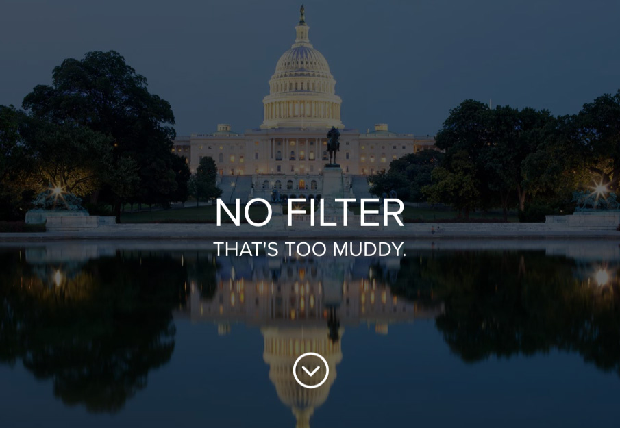
Near the end of a recent website project, I ran into an interesting problem. The client wanted to switch the main color of the site to black. And while the magic of CSS makes that request straightforward, there was a rub. I had used color overlays on top of all of the pages’ image headers. Now that the overlay was black, the photos used in those headers lost a lot of their brightness and contrast.
At over 400 posts and pages, this was a problem. Rather than bump every photo up in Photoshop, I thought I’d try something new: SVG Filters.
SVG Filters
SVG Filters are supported by browsers and are easy to create. I created a simple filter in 10 lines of code:
<svg version="1.1" xmlns="http://www.w3.org/2000/svg">
<filter id="lighten">
<feColorMatrix
type="matrix"
values="1.5   0    0    0    0
        0   1.5    0    0    0
        0   0    1.5    0    0
        0   0      0    1    0 "/>
</filter>
</svg>
The first and last lines are obvious. They’re just the declaration and closing of a new SVG file. Next comes the filter, where the magic happens. I named mine “lighten.” The id is similar to an id in CSS. You can name it whatever you’d like.
I chose to use the “feColorMatrix” filter type to on my photos. It’s supported by browsers, and it uses a matrix to change color values by RGBA channels. They are as follows:
R  0  0  0  0
0  G  0  0  0
0  0  B  0  0
0  0  0  A  0
Each column represents a channel. The first column is Red, the second is Green, the third is Blue, and the fourth is Alpha. The last column is a multiplier. You can create a dazzling array of different effects with these.
I spent an hour of free time just playing around with different combinations. I have to admit. It’s hard for my brain to switch over to numbers instead of using Photoshop. Thankfully, what I wanted to do was easy. I just wanted to bump up the colors of my photos. I added a simple ‘1.5’ to RGB columns and a ‘1’ to the Alpha channel to achieve a basic brightness and contrast bump.
Wrapping It All Together with CSS
Now that I had a working filter, I had to implement it somehow. This ended up being easier than I thought with CSS. First, you upload your SVG file somewhere on your server with FTP. Don’t upload it in WordPress via the Media Gallery. WordPress does many amazing things, but it won’t understand how to log the SVG file in its database. And it’s easy enough to add the file to the server with your FTP client. I added mine to the child theme I had created.
Next, in your child theme CSS, make the rule:
.lighten-header {
filter: url('../path/to/svg/file/filter.svg#lighten');
}
I created a class so I could reuse it several times on a page if I needed. Then, I made the call to the path of my SVG file. Additionally, you have to name the id to your filter in the call to the url (`#lighten`) in order for it to work.
If I wanted to make things even easier for myself, I could have just used one of the existing photo header classes. But I wanted some flexibility in case there needed to be another change down the road. Or if there were more images that needed the filter applied. From there, it was a quick process to add the class to the headers.
Before & After
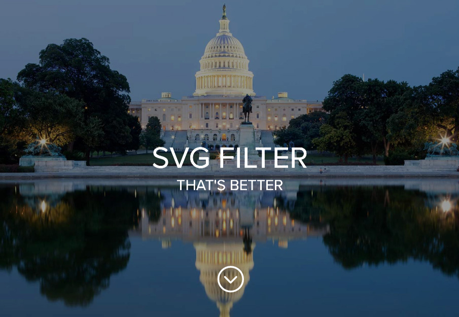
Even with creating batch actions in Photoshop, this process saved me hours of time, which in turn saved the client money.