A well-designed, informative homepage creates a positive first impression and encourages visitors to explore other pages on your site, so you can convert more customers. Here’s a comprehensive guide to homepages, with design inspiration from successful homepage examples and tips for creating your own strong business homepage.

What Every Homepage Needs
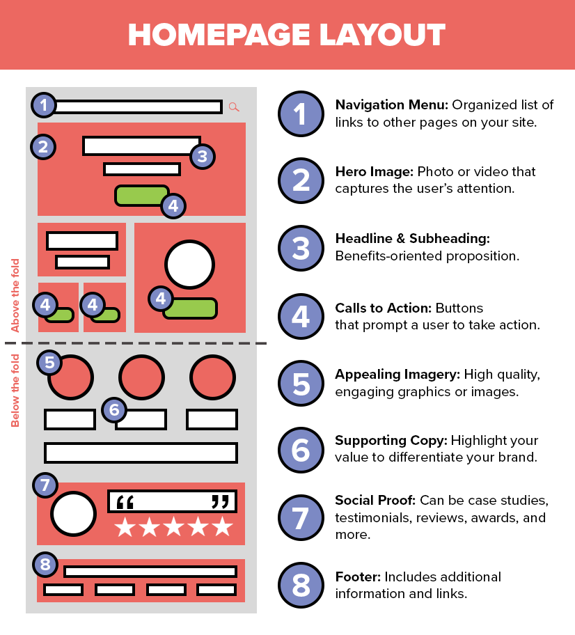
While there’s no one-size-fits-all template for designing a homepage, as it must be tailored to your specific business, there are still some crucial elements that should be included on every homepage. In order to improve your on-page SEO, inform your audience, and generate more leads, your website homepage needs to include the following elements.
Navigation Menu
A clear and organized menu helps visitors explore your website and find what they’re looking for. Use a drop-down menu with sub-navigation that links to other pages on your site, like your About Us page, location pages, and service pages. Include a search bar for more convenience. Straightforward website navigation with strong internal linking is not only helpful for users searching for specific information, but can also help Google crawl your site.
Hero Image
When visitors land on your homepage, they should first notice a captivating hero image or video, which is a high-quality visual that tells a story about your brand. Consider a striking photo of your products, a picture showcasing happy customers, or another creative element that grabs users’ attention, sets the tone for the rest of your website, and leads people to convert.
Compelling Headline & Subheading
The next element a visitor should notice is your headline—clear and concise copy that conveys the most important information about your brand. Typically, that’s your business’ unique purpose and the benefits your product or service has on your customer. If you nail this messaging, it’ll motivate people to scroll past the hero section for more information. Pair your headline with a subheading if you need additional context, or use this space to insert a memorable tagline instead.
Strong Calls to Action
An effective call to action (CTA) tells your visitors how you want them to interact with your business, whether by making a purchase, signing up for a service, calling, or getting directions to your store. Homepages should have a primary CTA above the fold to boost conversions. Secondary CTAs can be scattered throughout the homepage and placed at the bottom to prompt users to take other actions. A/B testing can help track and measure the effectiveness of your CTAs, so you can make data-driven adjustments to copy and placement over time.
Supporting Copy
Throughout the page, call back to your unique value proposition. Briefly and clearly highlight the benefits of your brand, products, or services to your target audience. Demonstrate what makes your business special to differentiate yourself from competitors and show potential customers why they should choose your business over others like it. Focus on your key offerings and experience in the industry to enhance your credibility.
Appealing Imagery
Use high-resolution, optimized images on your homepage to catch attention and show off your brand’s personality. Images break up blocks of text, convey information about your business in a visual way, and make your homepage easier to digest. Upload visuals as WebP files so they load faster on the page, and add relevant keywords and alt text to make your site more accessible for website crawlers and visually-impaired readers.
Social Proof
Including social proof on your homepage is an effective way to back up your claims and build trust with your audience. User-generated content—like positive customer reviews or testimonials—demonstrates that other people have had good experiences with your brand, which can convince potential customers who are still on the fence. Similarly, having case studies and awards on your homepage positions you as an expert in your industry and gives potential clients reassurance that you’re a legitimate and results-driven.
Footer
At the very bottom of your homepage, your footer should include relevant information about your company, such as contact details, address, and social media links, as well as your privacy policy and terms of service. You may also want to have a secondary navigation menu here to help customers and bots access other information, like your blog and sitemap.
Homepage Design Examples
An effective homepage hooks users’ attention and increases conversions. Here are 15 examples of website homepages across various industries to inspire you as you create your own!
Askinosie Chocolate
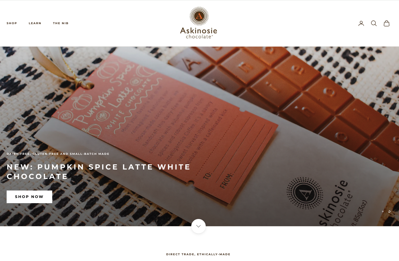
The homepage for Askinosie Chocolate has clear messaging and displays their best-selling products through high-quality images, while the copy provides details about the company’s mission, values, products, and origins. Their CTAs are geared toward a variety of actions for users to take, from shopping their products to booking a tour of the chocolate factory to subscribing to their e-mail list. Though this homepage is executed well, breaking up the three large paragraphs into bite-sized chunks throughout the page would help improve readability.
Key takeaways from Askinosie Chocolate:
- Primary and secondary CTAs placed throughout the page
- Highlights reputable brands that have featured their products
- Footer has relevant business information and internal links
Bed Threads
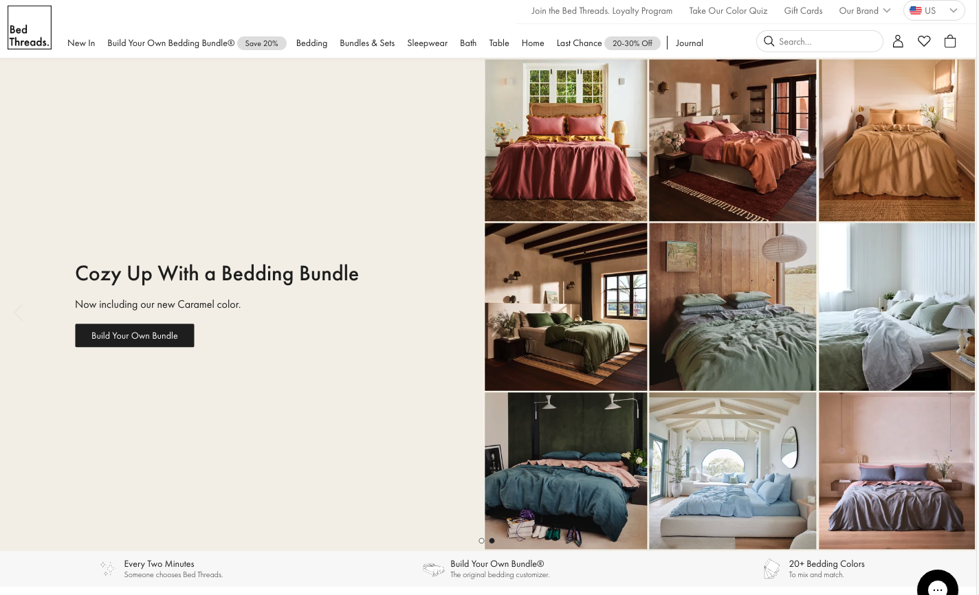
Bed Threads’ homepage is eye-catching, immediately offering stunning images of their products. Products are easily shop-able and the homepage even includes information for building your own bundle to showcase how customizable their products are to customers’ preferences. Several CTAs are visible above the fold, which can help convert shoppers. And with text like “Every Two Minutes Someone Chooses Bed Threads,” they expertly capitalize on social proof without having to use specific testimonials or case studies. Bed Threads could potentially improve their page by reorganizing or condensing the navigation menu at the top of the page, as it currently appears a bit busy.
Key takeaways from Bed Threads:
- Neutral color scheme helps the text and products stand out
- Variety of high-quality product images
- Concise, value-driven header and subheading
The Bookworm
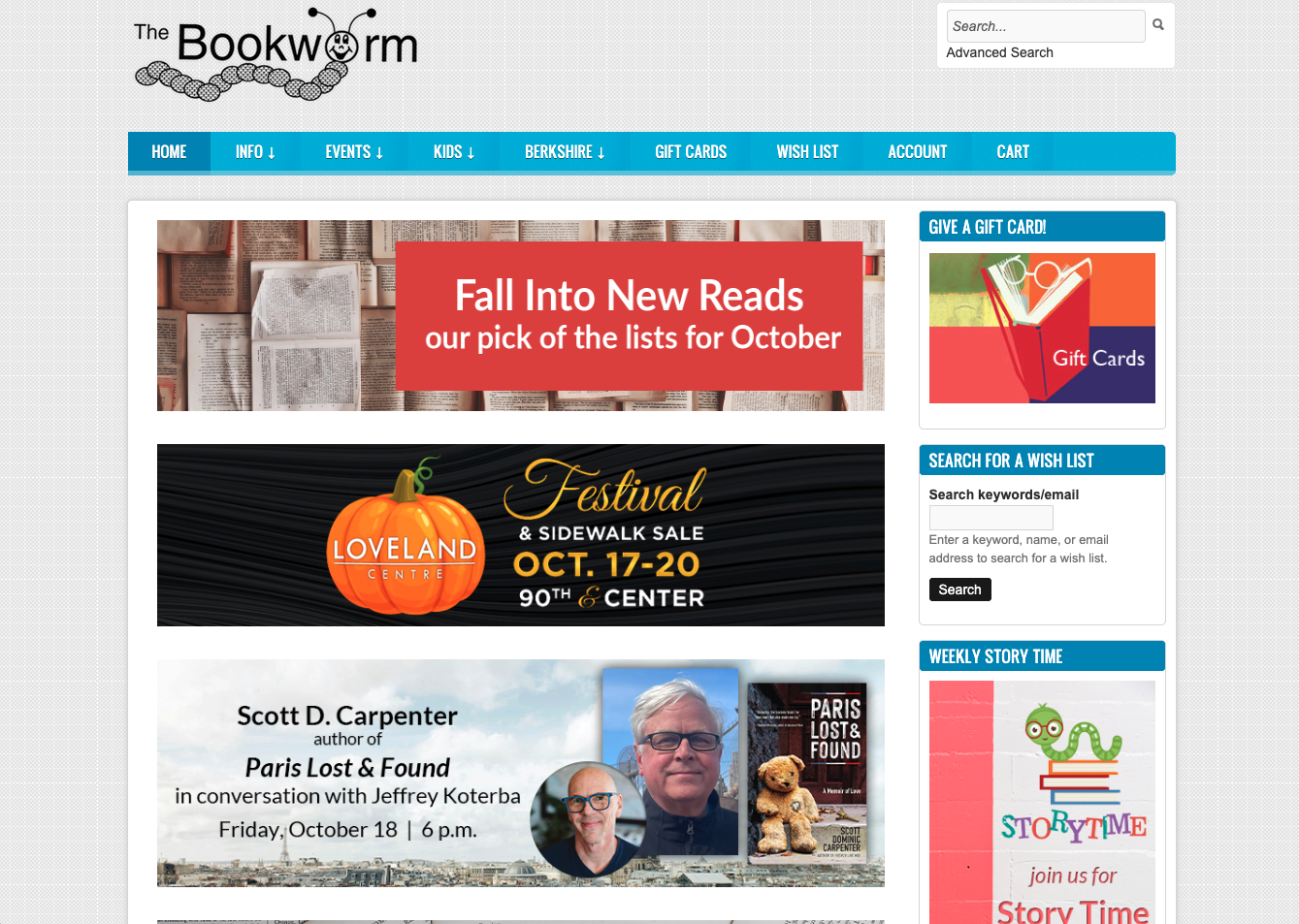
The homepage for The Bookworm caters to its target audience, providing a search bar that helps customers find books quickly and easily. Additionally, the homepage is updated regularly, so visitors can see upcoming events, seasonal reading recommendations, and more. The page works well on mobile, though the desktop view has a large amount of white space in the middle of the page, so reorganizing and filling this space could improve user experience. Adding a header and subheading at the top of the page that depicts who they are and why you should be interested in their services would elevate the page as well.
Key takeaways from The Bookworm:
- Mobile-friendly design
- Strong drop-down navigation menu
- Eye-catching visuals about upcoming events
Centris Federal Credit Union
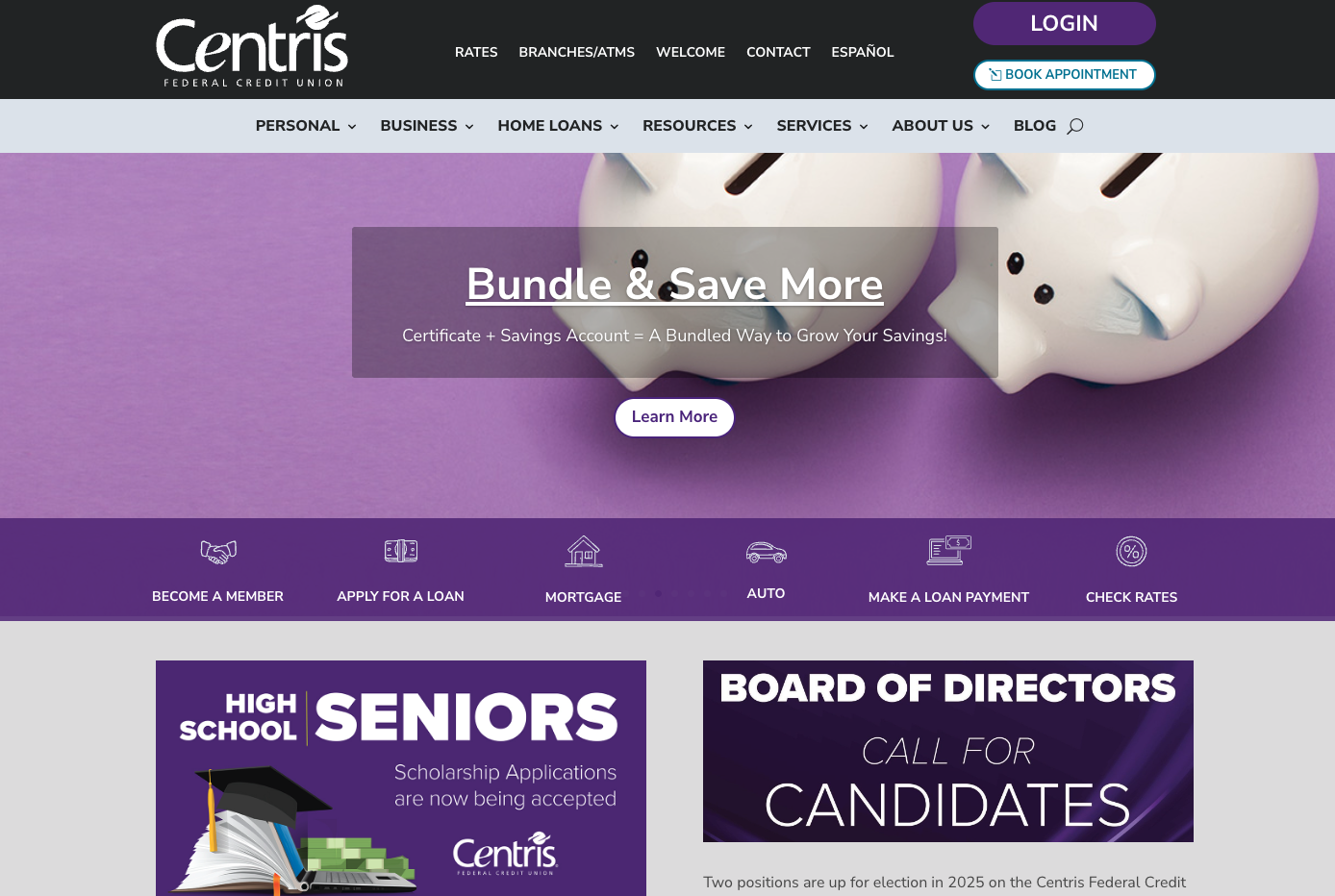
The homepage for Centris Federal Credit Union showcases why customers should consider banking with them, explaining key benefits like lower interest rates on loans and higher APYs for savings accounts. Several CTA buttons are used on this homepage, which encourage people to enroll in programs, book an appointment, and listen to the business’ podcast. Centris also does a good job building trust and expertise with their audience by including how many members, locations, and years in business they have. Adding customer testimonials could further help with credibility and trust.
Key takeaways from Centris Federal Credit Union:
- Intuitive drop-down navigation menu
- Icons in footer depict awards the company has won
- Audience-focused headlines and body copy
Core Bank
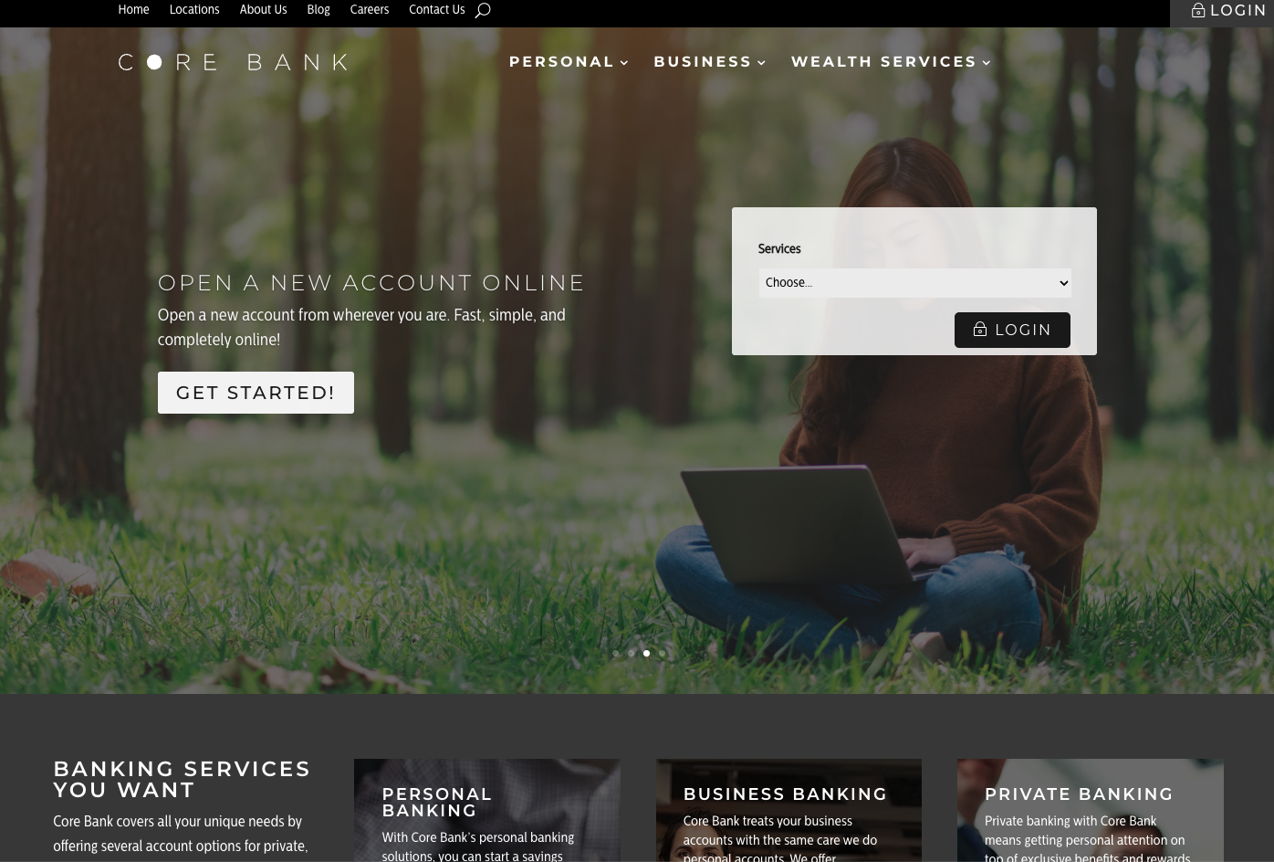
Core Bank’s homepage immediately compels customers to take action, allowing users to click through various images and CTAs, like opening a new account and exploring their tools. The page has a straightforward navigation menu that gives customers easy access to log into their account or visit other pages on the site. The homepage also includes links to a blog to help customers learn more about topics in the banking industry and encourage them to continue to stay on the site for longer. However, the homepage is lacking social proof and could benefit from more reviews from members.
Key takeaways from Core Bank:
- User-friendly search bar
- Copy succinctly answers frequently asked questions
- Includes a contact form to drive conversions
Diventures
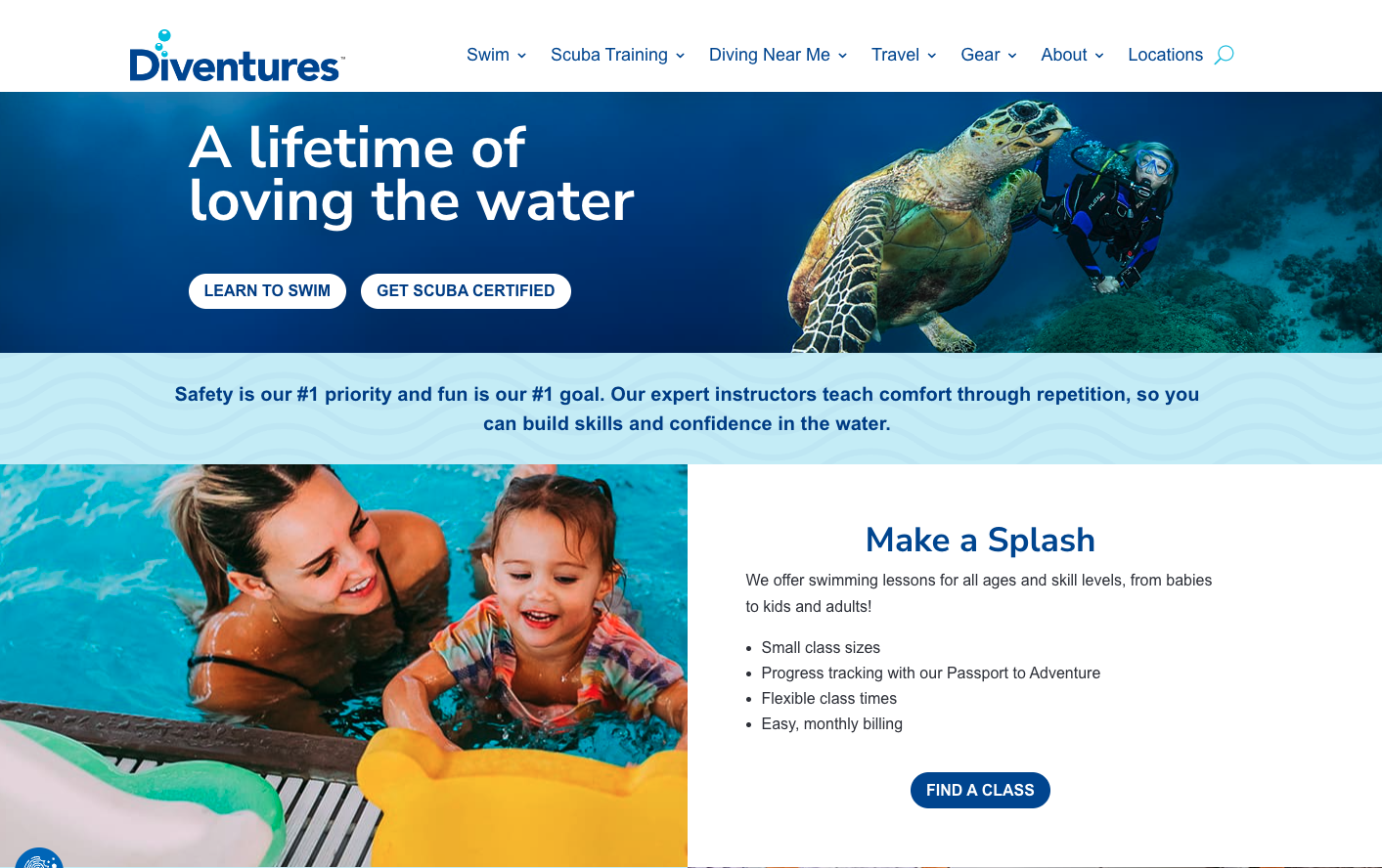
The homepage for Diventures uses high-quality images showing happy customers—from adults scuba-diving to kids in swimming lessons. The human touch and the color scheme are consistent with their branding of being friendly, family-oriented, and safe. Those themes are carried through their messaging, too, with an opening statement about the company serving people of all ages and their commitment to safety. The page also includes testimonials, logos of their safety certifications, and a variety of buttons and links that offer easy access to service and location pages. However, the homepage could be improved with a stronger, more benefit-oriented header in the hero.
Key takeaways from Diventures:
- Many CTA buttons with unique anchor text
- Bullet points break up large blocks of text, making the page easier to skim
- Robust footer includes a sign-up form
Health Ceramics

Health Ceramics’ homepage makes their products—dinnerware, decor, and tile—obvious from the hero. The company uses bright, engaging images to help sell their wares to customers. The navigation menu features primary categories with sub-categories for more specific interests, ultimately creating an effective all-in-one place for users to peruse the entire site. However, the homepage presents a high volume of information, which customers might get lost in, so condensing any non-crucial information could help improve this page.
Key takeaways from Health Ceramics:
- Easy-to-read fonts
- High-contrast color scheme
- Concise body copy
Hurrdat Sports Bar & Grill
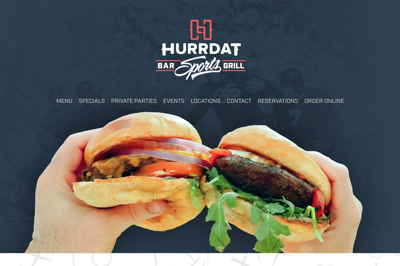
The Hurrdat Sports Bar & Grill homepage uses food imagery to entice customers to visit, with a bold hero image that consumes everything above the fold. It has a solid navigation menu that encourages online ordering or making a reservation, and the page has its own section for events held at the restaurant. The homepage includes social proof and pulls out keywords from reviews so potential customers can easily see the main point when skimming the site. One way this homepage could be improved is by including a heading and subheading above the fold that communicates information about the brand and the unique value they offer as a restaurant.
Key takeaways from Hurrdat Sports Bar & Grill:
- High-resolution photos of happy customers and products
- Every section features a CTA
- Plenty of testimonials gathered from soft opening
InkWELL Press
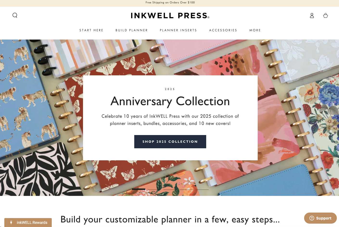
InkWELL Press’ homepage is colorful and clearly explains the process of how to build your own customizable planner using their services. This simple website homepage design includes all the basic elements, including testimonials, several CTA buttons to shop specific products, and logos from recognizable companies InkWELL has been featured in, such as Buzzfeed. One thing missing from this homepage is a prominent display of the company logo—an upright feather—that would help with brand recognition.
Key takeaways from InkWELL Press:
- Guides customers through the buyer journey with a “Start Here” option
- Up-to-date promotions of current sales and discounts
- Good use of white space to make colorful site easy to read
Jungalow
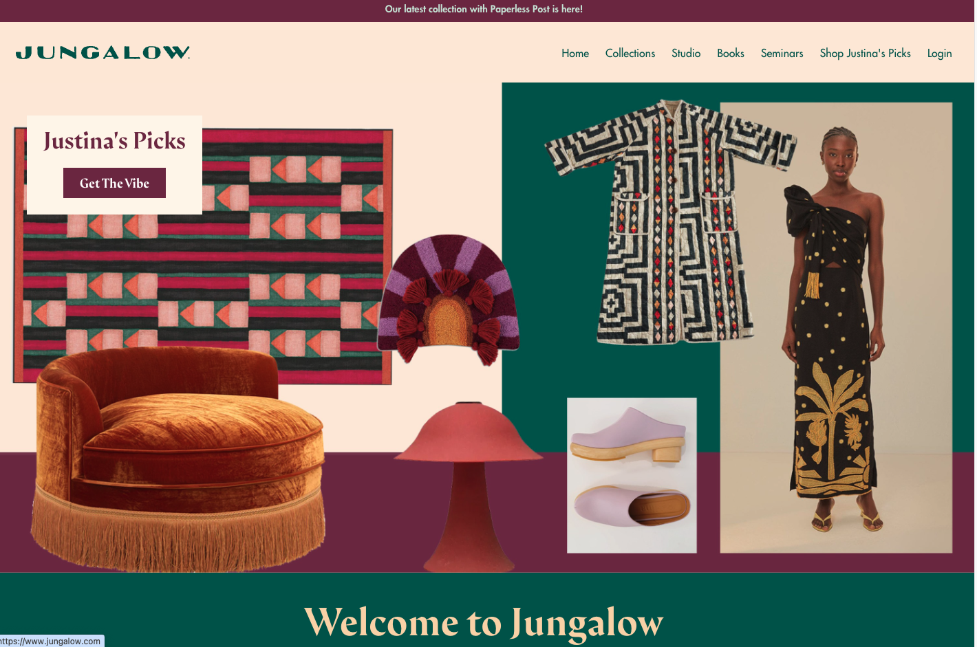
The homepage for Jungalow is well-designed, easy to navigate, and provides a strong overview of its products and services. Large, clickable icons showcase their unique value proposition and entice customers to follow their social media, find inspiration, and see how they’ve given back to the community. The concise navigation menu also helps users find the information they’re looking for quickly. This homepage could be improved by using a sticky navigation menu rather than two separate bars at the top and bottom of the page and including social proof from satisfied customers.
Key takeaways from Jungalow:
- Navigation menu present at the top and bottom of the page
- Engaging, consistent color scheme
- Prominent links to social media profiles
Kido Chicago
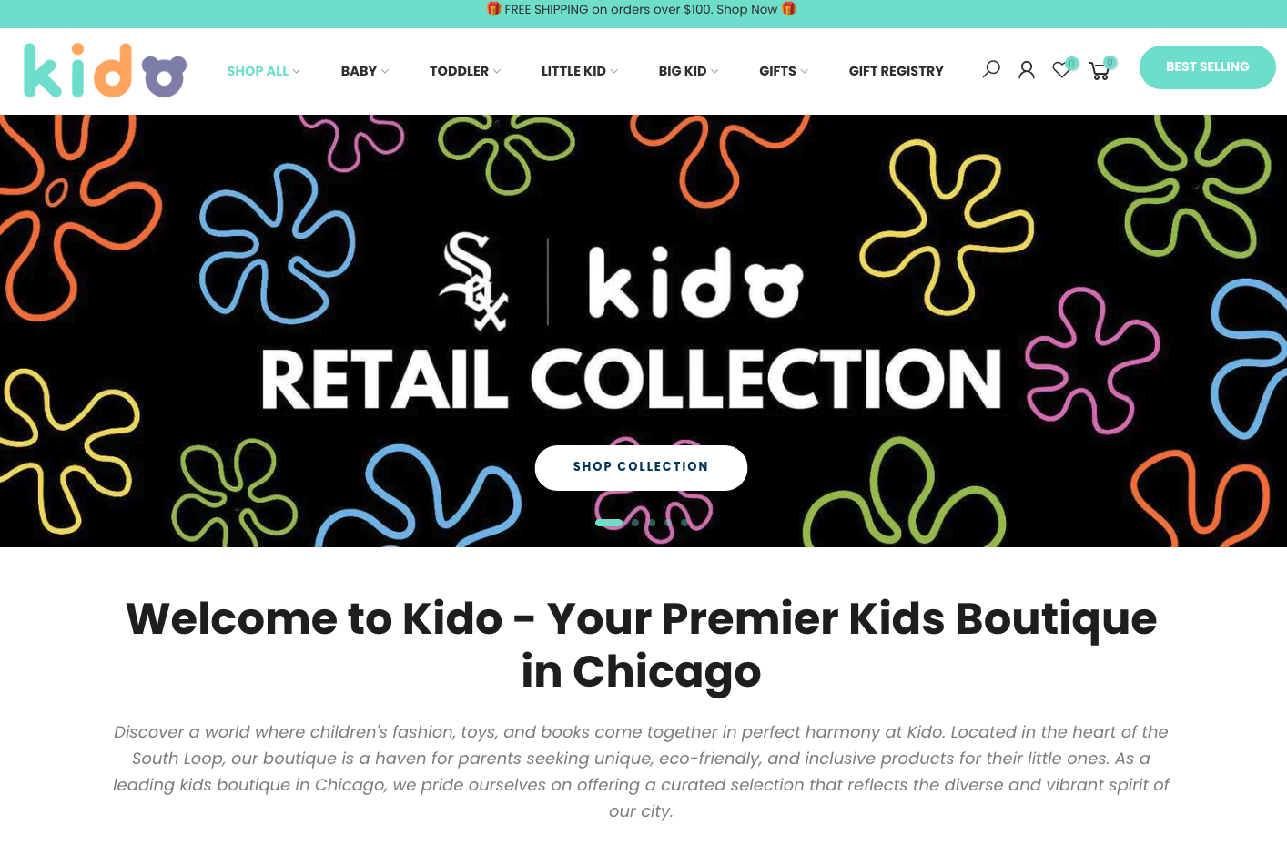
Kido Chicago’s homepage effectively displays its products for kids. Its intuitive navigation menu helps customers browse the company’s various types of products easily. This award-winning kids boutique also features testimonials from customers and includes icons of popular press features to showcase its credibility, and the homepage copy distinguishes them from competitors by highlight their commitment to diversity, sustainability, and originality. However, the page could benefit from utilizing more icons or graphics to represent their offerings and values, which would help cut down on copy and make the page more digestible.
Key takeaways from Kido Chicago:
- Emphasis on the brand’s mission and values
- User-friendly navigation menu
- Descriptive, varied CTA buttons
Midlands Family Urgent Care
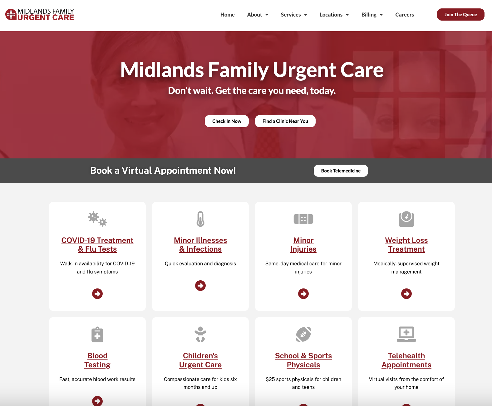
The Midlands Family Urgent Care homepage provides a clear overview of its wide range of services—from flu testing to telehealth—along with clear CTAs to explore those service pages. Testimonials are displayed from satisfied patients, and the homepage is easy to navigate and provides a direct navigation menu. The homepage could be improved by taking higher-quality, unique images of their locations and team.
Key takeaways from Midlands Family Urgent Care:
- Quick access to more information without cluttering the page
- Color changes and headers make distinction between sections more obvious
- Strong CTAs address immediate needs of the audience
Partake
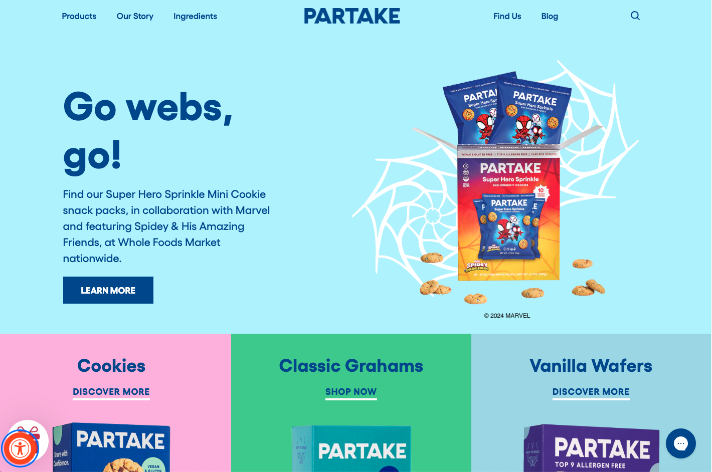
Like many other homepage design examples on this list, Partake’s colorful homepage has beautiful product photography and unique selling propositions—like allergen-free ingredients and donations to families with food insecurity. Where their homepage differs is with their commitment to accessibility and inclusivity. This mission is backed by design settings—allowing visitors to adjust line height, contrast, brightness, and more. The page could try reorganizing so information about who they are is present above the fold.
Key takeaways from Partake:
- High-quality product images
- Succinct copy in easy-to-read fonts
- Clear value proposition
The Peony Collective
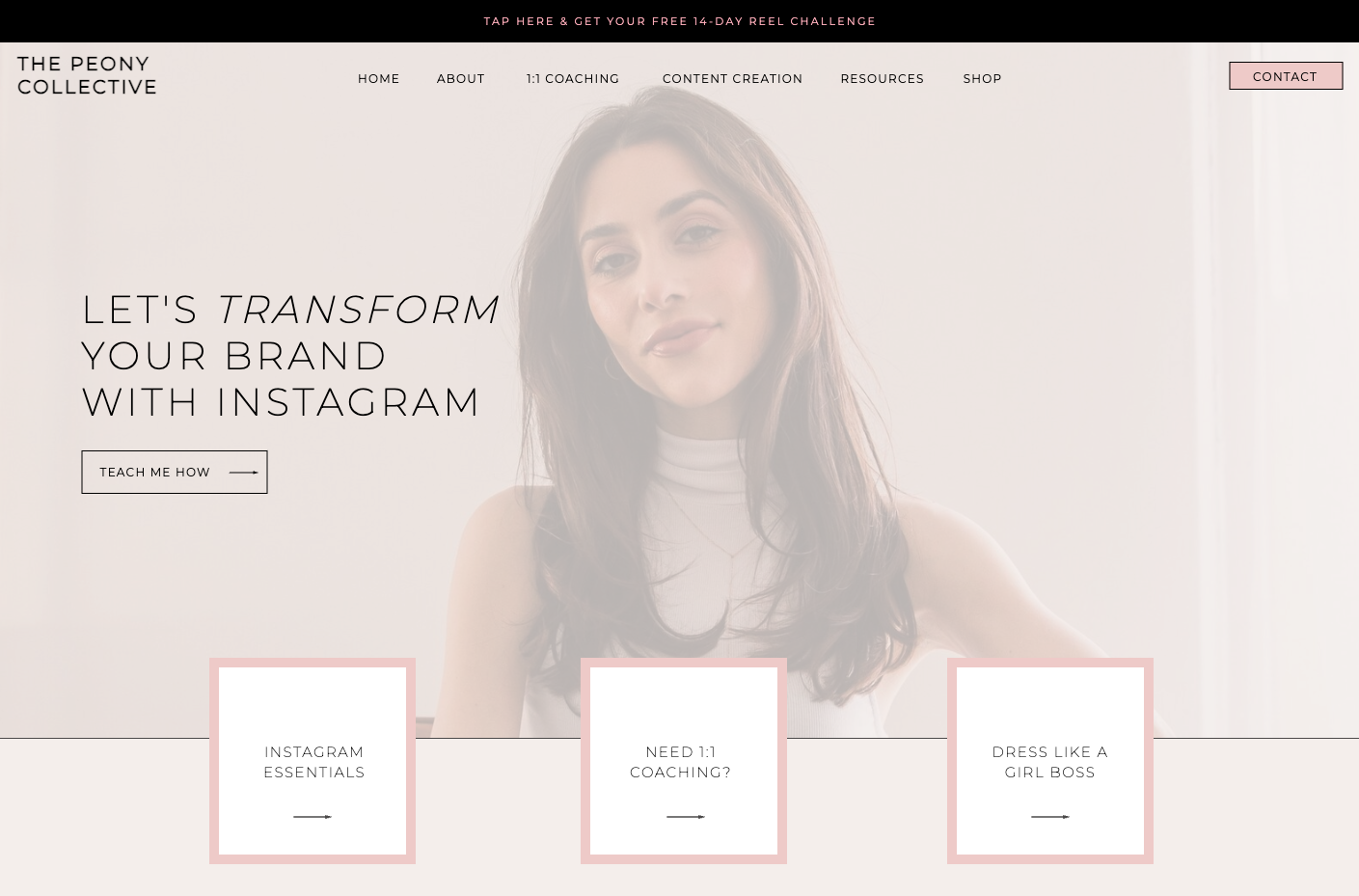
The Peony Collective homepage is informative without being overwhelming. It’s made clear right away what this company does and who its target audience is. Testimonials from satisfied clients are present, with images that humanize them, which can help potential clients feel more confident about the company. The homepage also includes CTAs for various services which provides various avenues for increasing conversions. The homepage also uses trendy, friendly language to can help clients feel considered. However, the primary font is thin and small, so making this larger or bolder could increase readability.
Key takeaways from The Peony Collective:
- Straightforward navigation menu
- Use of data to establish experience and credibility
- Feminine design style caters to target audience
State Fire
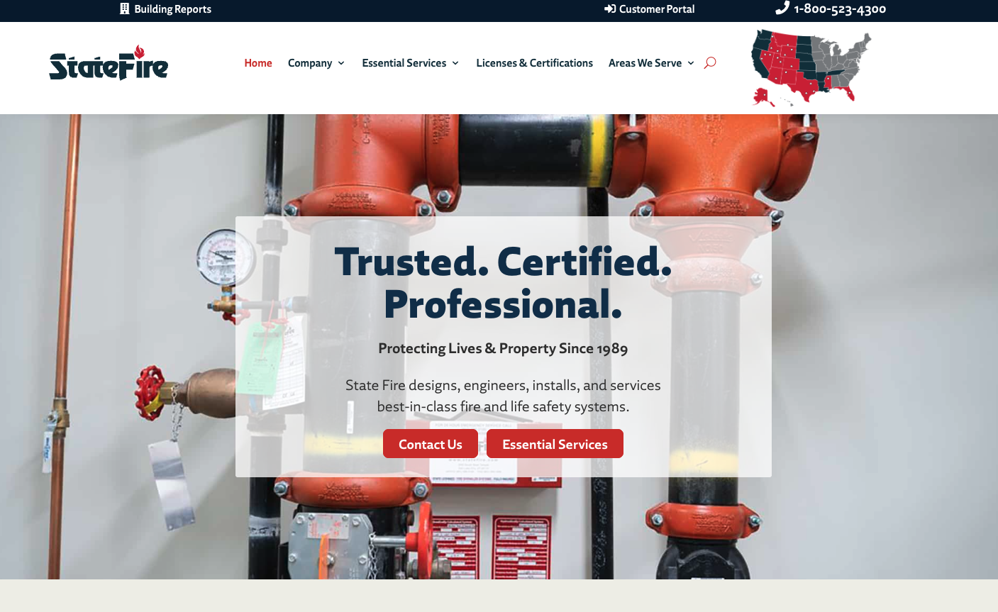
State Fire’s homepage immediately describes what the business does and conveys trustworthiness in the header and subheading by noting that they’re certified and have been in business since 1989. They also have a short sentence to concisely describe their services so that customers who are unfamiliar can immediately get an idea of what the business offers. The page includes a map to help customers easily find a location near them, along with various CTAs to direct customers to take action. The bulleted list under their “Industry Expertise” section is difficult to read, however, and could be improved by using icons.
Key takeaways from State Fire:
- Concise explanation of offerings via copy and video
- Section dedicated to testimonials
- Visual representation of primary services
How to Design an Effective Homepage
Though every homepage will look different, there are several website homepage design best practices that’ll make your page perform better. Consider the following homepage design tips to drive more conversions.
Understand Your Target Audience
To know your audience’s needs, conduct an audience analysis to learn who your current clients are and what they care about. This can help you craft engaging content on your homepage that’s tailored to your visitors and their pain points. Emphasize how your products and services can benefit their lives to inspire them to continue interacting with your page and business.
Keep Copy Concise
Trying to cram in too much content can result in a cluttered homepage that causes visitors to lose interest, so prioritize the most important details. Long sentences or blocks of text on a homepage can be overwhelming. Short, snappy sentences are more likely to capture attention and engage visitors. When possible, include bullet points, numbered lists, subheadings, images, and icons that “show” rather than “tell” to keep the page scannable. And avoid any jargon or technical terms that might confuse visitors.
Strategically Organize Information
The best homepage design ideas draw attention to the most significant parts of your page. Include relevant details above the fold so visitors can find what they need right away. Bold or enlarge the font of important words and phrases to help them stand out and be more readable. And be sure to leave plenty of white space to balance the content on the page.
Prioritize User-Friendliness
Ensure your homepage has a mobile-friendly design by keeping paragraphs short, making buttons large enough to click with a thumb, and selecting appropriate font sizes for small screens. To help provide a seamless user experience, prioritize fast loading speeds and ADA compliance. Make information even easier to find by including an intuitive navigation menu and search tool across your whole website.
Have Consistent Branding
Keep your brand identity in mind when designing your homepage. Stick to a few colors and easy-to-read fonts that align with your brand, and always adhere to your brand voice throughout the copy. Consistency in these areas will reinforce your brand identity and help you create a cohesive, memorable homepage that’s authentic to your business.
Need to design a homepage for your business? Hurrdat Marketing offers content marketing and web design services that can help you create an effective homepage for your website. Contact us today to learn more!


