A website service page gives visitors an explanation of how your company’s services might benefit them. When designing a service page, it’s important to keep search engine optimization, visual appeal, content quality, and brevity in mind. In this post, we’ll cover what a service page needs, examples of effective service pages, and how to create or improve your business’ service page.
What Every Service Page Needs
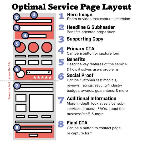
Each business’ service page layout will be unique to their offerings and brand identity. However, there are a few key elements that should be on every page. Including these helps your company’s service page attract more visitors, boost your site’s on-page SEO, and generate leads.
Quality Content
Content is key in creating a successful landing page. Crafting relevant, keyword-optimized content can help your page rank higher when someone is searching for your industry’s services. An effective service page should include clear, concise descriptions of what your business offers, using bullet points and short sentences to increase readability. You should also avoid using industry jargon so that new visitors can easily understand what you’re offering.
Engaging Visuals
Using relevant, high-quality images on your service page can help keep visitors interested while you showcase your work. Make sure all images are optimized for Google search to help attract more visitors to your page. You may also want to consider using WebP files so your images load quickly for a better user experience.
Internal Links
Incorporating internal links on your service page is important, since it both helps Google crawl your site and makes navigation simpler for visitors. Providing internal links also lets your potential customers easily learn more about your brand and what you offer, which may increase chances of conversion.
Answers to FAQs
Including a section for frequently asked questions on your service page can boost your SEO, as this helps you provide relevant answers to common search queries. FAQs can also increase the readability of your page, making it easier for visitors to find the specific information they’re looking for. To write effective FAQs for your service pages, look into what your audience is asking through a variety of keyword types and succinctly explain what your business does to help.
Relevant CTAs
A good call-to-action (CTA) is an essential element for any webpage, since it gives visitors a clear path towards becoming customers. Invite potential customers to fill out a contact form, schedule an appointment, sign up for an email list, or whatever action you would like them to take. Without clear direction on how to get started with your business, a visitor will likely look elsewhere.
Service Page Examples
No matter what industry you’re in, a great service page can help you build your brand and reach new customers. Check out these service page examples across multiple industries for inspiration while designing yours.
Bamboo Health
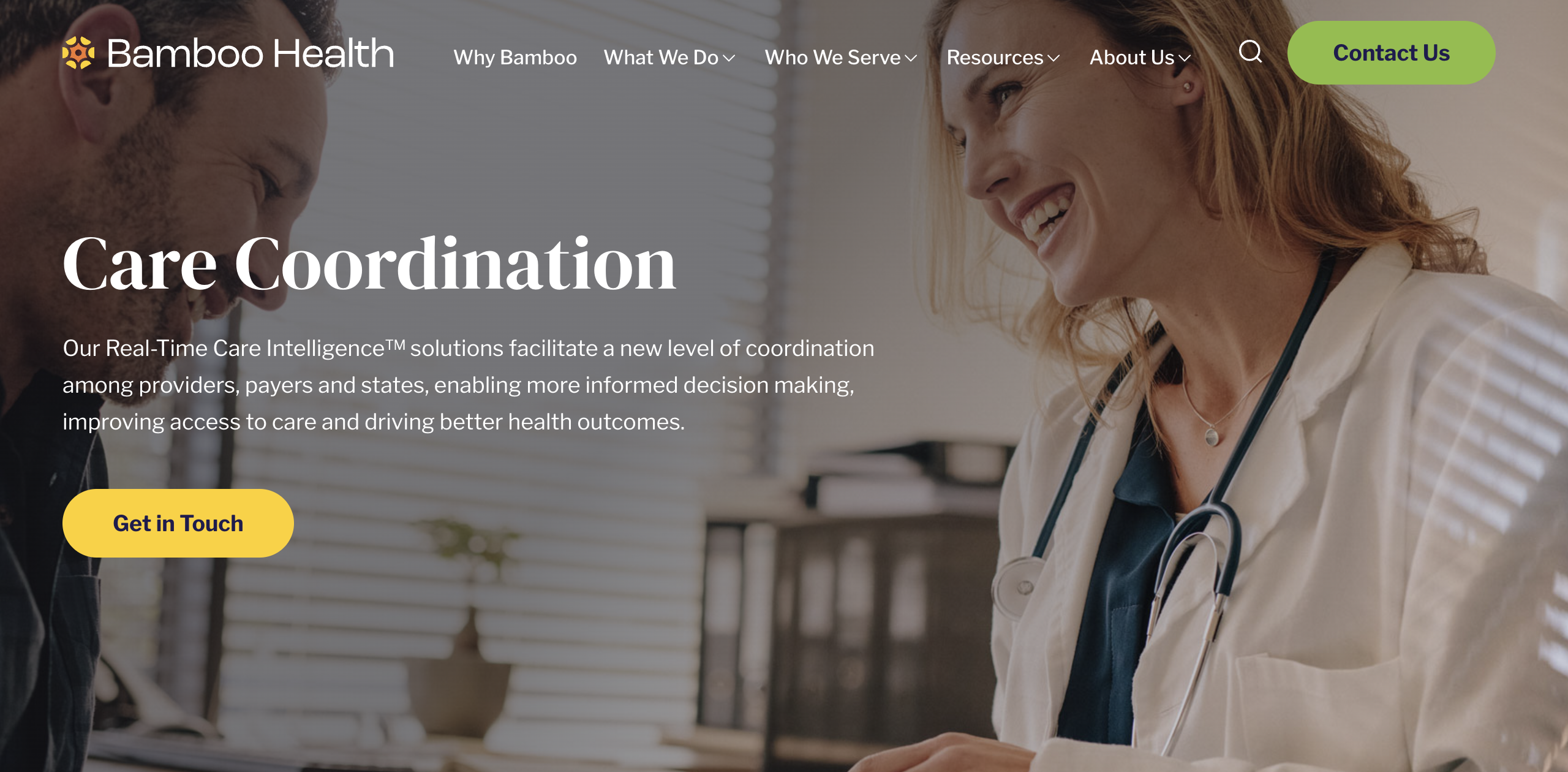
Bamboo Health’s Care Coordination service page features interactive icons that visitors can easily flip through to learn which service is right for them, as well as cheery visuals to create positive associations for customers. Long-tail keywords, concise content, and high-quality images all work together to create a great service page example. While they’ve used case studies and statistics to showcase their reputation, including customer testimonials could make this page even stronger.
Key takeaways from Bamboo Health:
- Clean layout and descriptions of services
- Interactive elements leading to more detailed information
- Inclusion of statistics and case studies
Hair Loft Studio
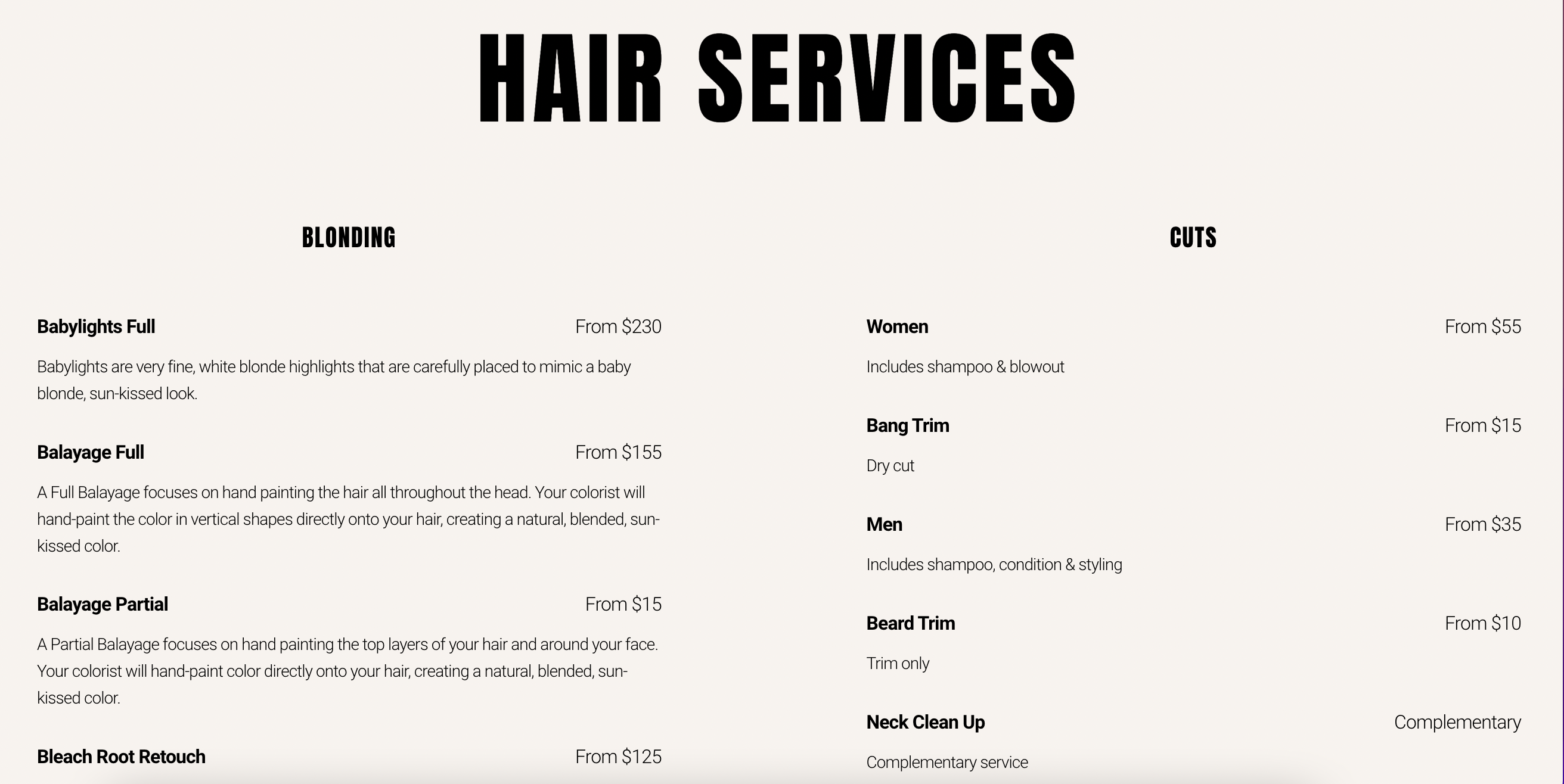
Hair Loft Studio takes a different approach with their hair services page. All services are listed together on one page, with a short description and price listed alongside each service. This is great for their industry, as customers can explore all of the related services they offer and determine the best fit for their goals and budget. However, although they’ve included a customer review towards the bottom, featuring multiple reviews (higher on the page) rather than just one could help build their credibility further.
Key takeaways from Hair Loft Studio:
- An engaging opening statement
- Transparent pricing model
- A specific, customer-focused CTA
House Buyer Network
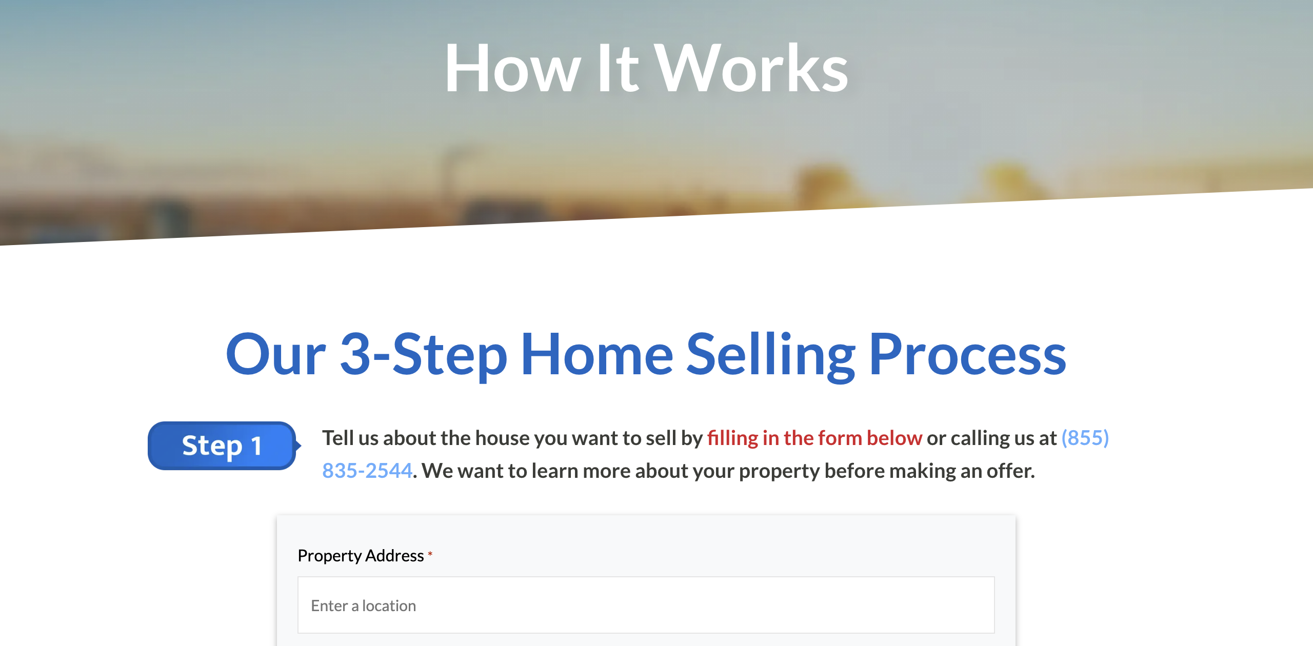
Featuring a large contact form at the top of the page as part of their service explanation, House Buyer Network’s service page immediately invites visitors to interact and connect. They provide a straightforward explanation of their home buying service and how it compares to a traditional home sale. They also use customer reviews to build their credibility. Though this service page example has a simple contact form and clear CTA, it is used repetitively throughout the page. To streamline their design, we suggest replacing these duplicates with unique CTAs.
Key takeaways from House Buyer Network:
- Simple lead-generation form
- Service descriptions focused on customer benefits
- Transparent, easy-to-follow process details
Lift Chicago
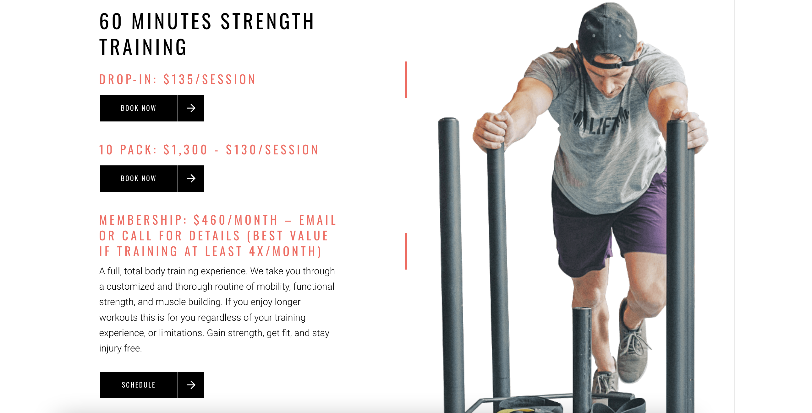
Lift Chicago’s Personal Training service page is a great example of matching your brand’s personality to your website design. It opens with a fast-paced video that highlights what sets their services apart from the rest. The text is short, relevant, and easy to digest, focusing on how their services can benefit a client rather than using excessive technical fitness jargon. The CTA buttons to book sessions are located right below descriptions of services, so visitors to the page can easily become customers. Though Lift Chicago does a great job of giving information to site visitors, an FAQ section that answers common questions about strength training may be a way to funnel more relevant people to their page.
Key takeaways from Lift Chicago:
- Relevant, engaging visuals
- Customer-focused copy
- Multiple conversion points
MailChimp
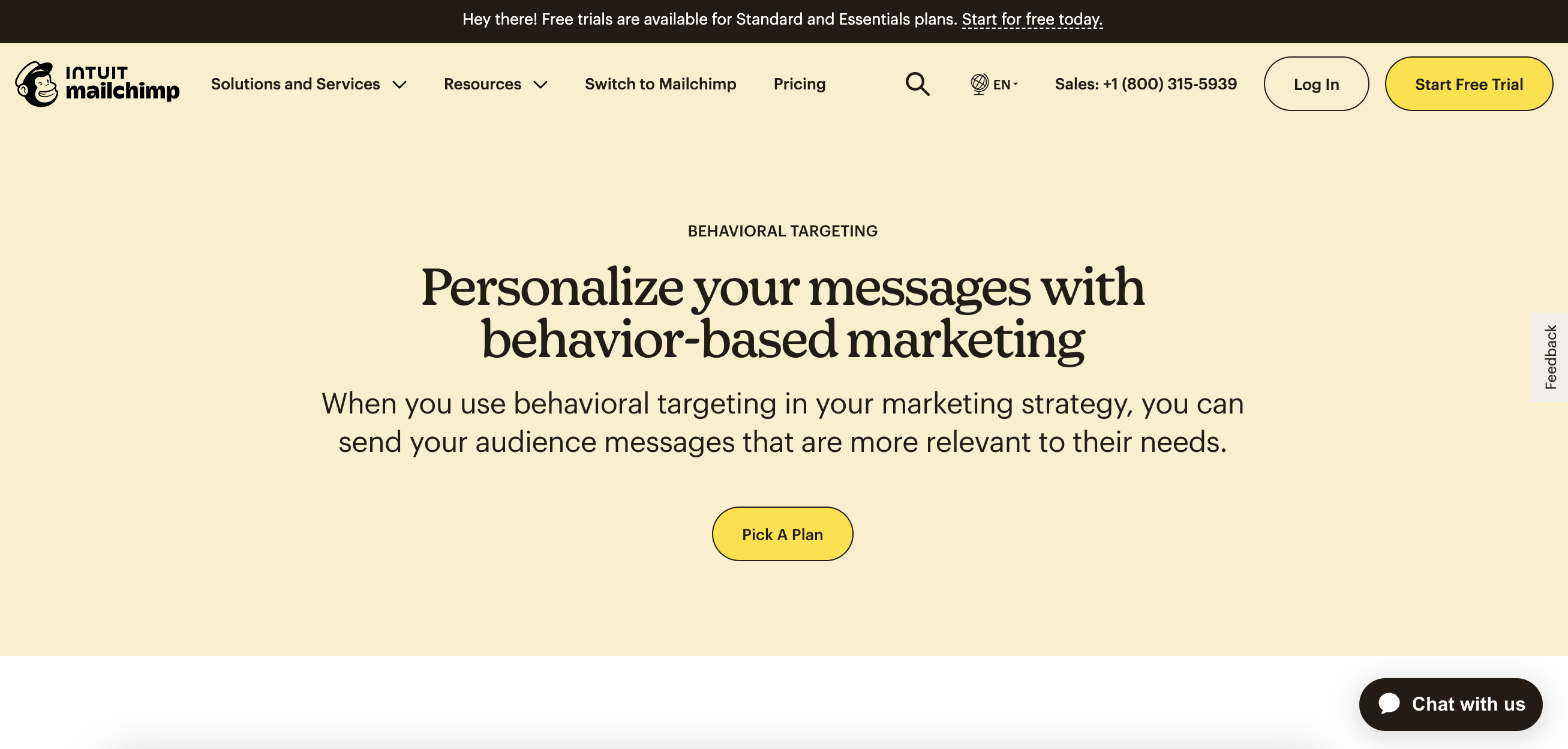
MailChimp uses a variety of relevant CTAs and engaging graphics on their Behavioral Targeting page. Visitors are reeled in with the short opening statement and concise messaging. Since their business offers a wide variety of services, they’ve utilized internal links to help showcase related offerings and generate more leads for those pages. Additionally, MailChimp’s FAQ section is a a great example of matching content to user search intent. That said, incorporating statistics or case studies could help potential customers gain a better understanding of the value these services provide.
Key takeaways from MailChimp:
- Unique call-to-action phrases
- Relevant FAQs and answers
- Internal links to related pages
Next Insurance
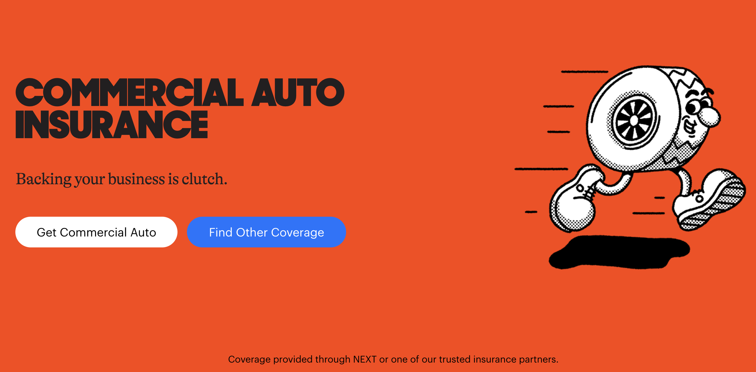
Next Insurance’s commercial auto insurance is another great service page example. You are met with a fun graphic and bold opening statement that display the brand’s friendly personality. Right below, there are two call-to-action buttons so visitors can decide which direction is right for their needs. The page also showcases customer reviews and logos of major news sources where this business has been featured, helping build trust between the company and the visitor. However, Next Insurance misses out on creating a more visually engaging experience, as there are few graphics and no photos.
Key takeaways from Next Insurance:
- On-brand opening statement
- Multiple CTA buttons catered to unique buyer journey
- Relevant FAQs
Ozark Drones
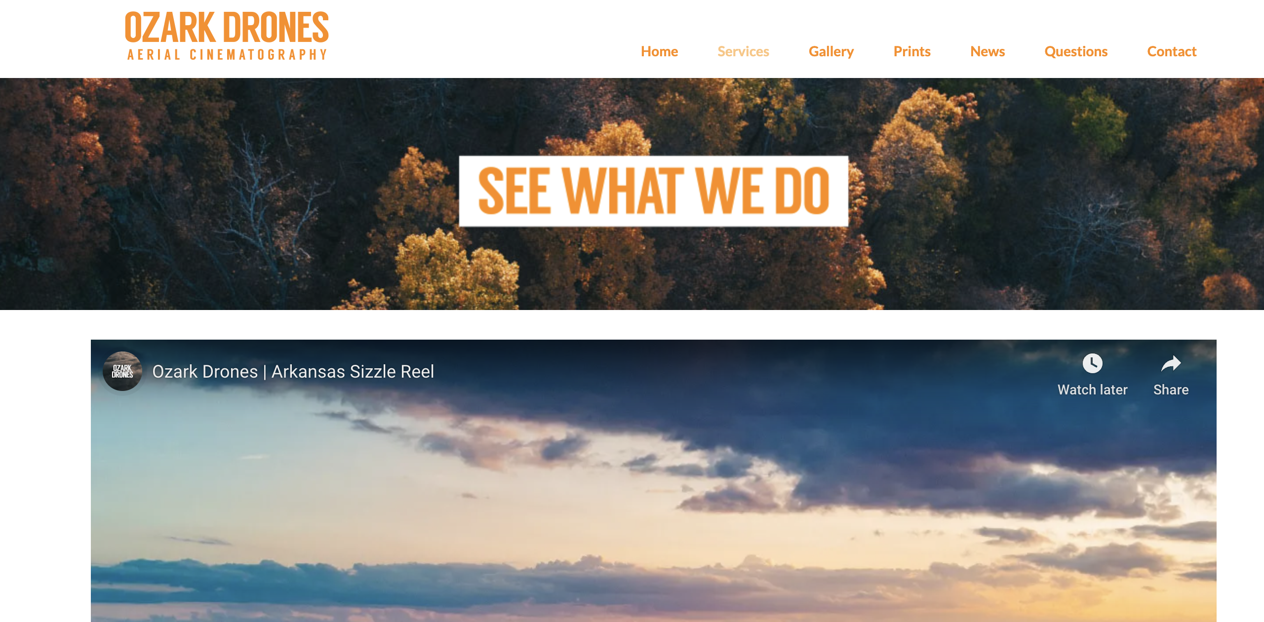
The first thing you see when you land on the service page for Ozark Drones is a large video of their work—which is smart for a video-based business. If you’re a wedding videographer, animator, real estate professional, or someone else who works in the video medium, you should consider using one of your video samples as your hero imagery. Ozark Drones also included a link to their photo gallery, so visitors can find even more visual evidence of the company’s past work. As you move through the page, you’re able to quickly learn about their services and see which industries they work with. However, it’s difficult for a visitor to know how to take action, since they haven’t provided internal links for their specific services or a clear CTA on how to start working with the company.
Key takeaways from Ozark Drones:
- Strong visuals to showcase work
- List of the industries the business works with
- Explanation of why customers should choose this business
Rev
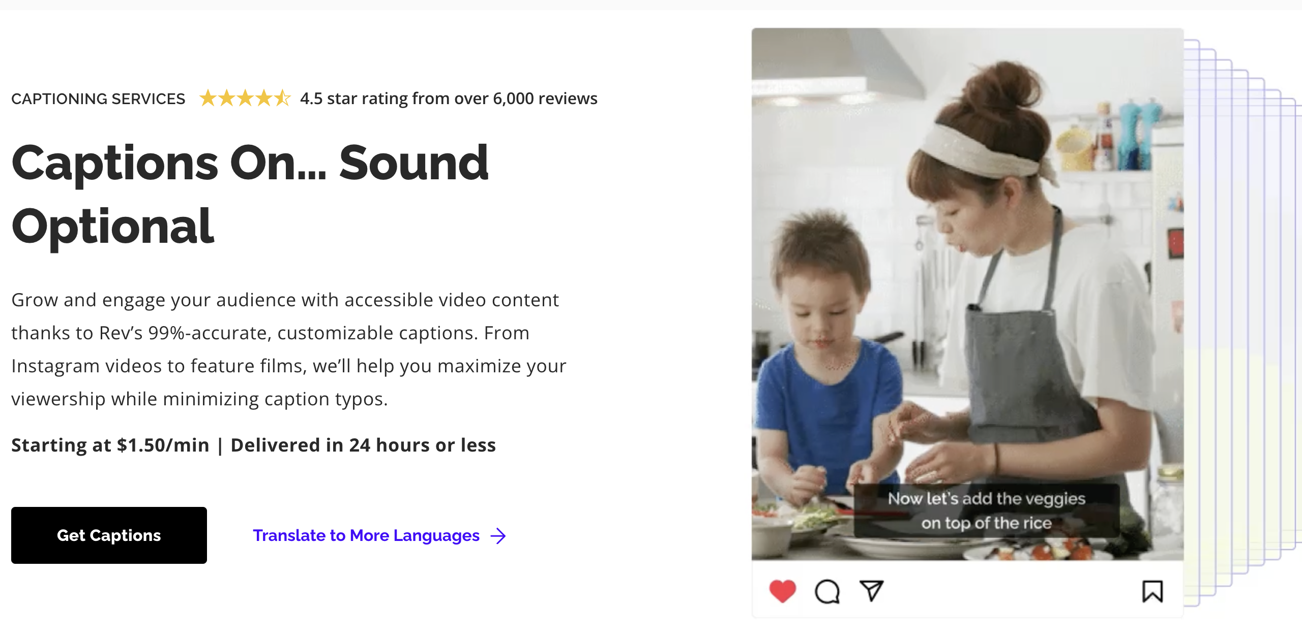
Visitors can be quickly reeled in by Rev‘s creative opening statement on their captioning service page. A CTA, price points, and ratings are all provided right at the top of the page. By using GIFs, Rev helps show that sound isn’t necessary when captions are present, making a great case for their services. While GIFs are a unique option, they do take a while to load and are not high resolution. Rev could consider using more web-optimized images to make their site more user-friendly.
Key takeaways from Rev:
- Unique, relevant graphics
- Copy crafted to address customer pain points
- Prices and timeframe displayed early on
Vermont Construction
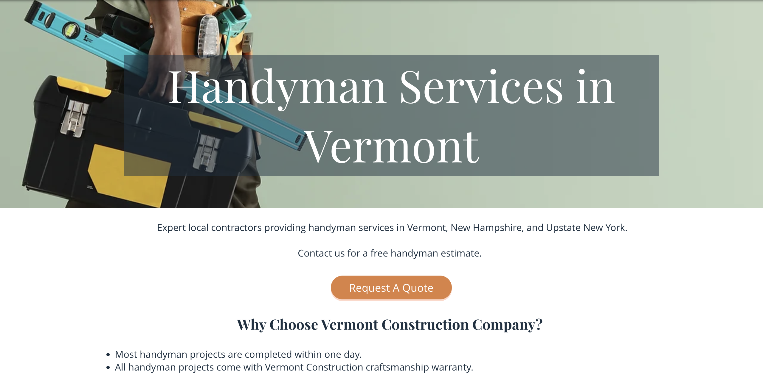
Look to Vermont Construction’s handyman services page for an example of simple, yet effective, service page design. This page includes keyword-optimized descriptions of services, client testimonials, call-to-action buttons, and bright, relevant visuals. However, Vermont Construction is missing out on the benefits of using internal links and FAQs.
Key takeaways from Vermont Construction:
- Visuals to showcase the work
- Simple design
- Clear descriptions of each service
How to Create High-Converting Service Pages
To build a successful service page, you’ll need to include key components and understand the purpose behind each section.
Develop Your Website Strategy
First, decide whether to create individual pages for each of your business’ services (usually called the hub and spoke model) or one general page that covers each offering. General service pages are great as a starting point—or for businesses who offer a few closely-related services—while individualized service pages are ideal for businesses with a wide range of offerings. Consider the needs of your business to decide on the best route.
Understand Your Target Audience
Before getting into the content, it’s important to know your audience. By tailoring your content to your target audience, you increase the chances that they will engage with your page, leading to more conversions and success for your business. Perform an audience analysis to better understand who your customers are and what they’re looking for.
Conduct Keyword Research
Thorough, targeted keyword research will help you properly optimize your content for organic search results. Use industry-specific terms and long-tail keywords that align with prospective customers’ search intents. Focus on a variety of terms and create a unique strategy for each page to avoid keyword cannibalization, which can hurt your SEO.
Address Pain Points
When discussing your services, speak to your potential customers’ pain points. Focus on their needs and the solutions your services can provide rather than simply laying out a description of your services. Bonus tip: using “you” language can help the reader feel as though you’re speaking directly to them.
Establish Trust
Service pages should include elements that help your business build trust with customers. Consider incorporating logos of your previous clients, reviews and testimonials, case studies, proof of ROI, industry certifications, organization affiliations, or awards—all of which demonstrate brand authority and can help your business create trust online.
Trying to design a service page for your business? Hurrdat Marketing offers content marketing, search engine optimization, and website design services that can help you build effective service pages for your website. Contact us today to learn more!


