A mobile-friendly website is designed to work seamlessly across all devices. Mobile-friendly design improves user experience and site navigation, and it can help you show up in relevant search engine results pages (SERPs). In fact, Google predominantly uses the mobile version of a site’s content for crawling, indexing, and ranking as part of its mobile-first index. Here’s what you need to know when designing a website for mobile.
- Types of Mobile-Friendly Web Design
- How to Design a Mobile-Friendly Website
- How to Check a Website for Mobile-Friendliness

Types of Mobile-Friendly Web Design
There are three common ways to optimize a web presence for mobile: mobile-dedicated, responsive, and dynamic serving. All of these options have their advantages and disadvantages, so consider your website goals before committing to one.
Mobile-Dedicated Web Design
Businesses with a dedicated mobile website offer a shrunken-down version of a desktop screen that’s the same across platforms. This option allows mobile users to view, browse, and use the website on different devices—however, without responsive elements in place, differences in screen resolutions can result in poor user experiences. Small business web design, used in conjunction with a mobile app, can boost mobile device compatibility by creating a website that’s mobile-dedicated and mobile-responsive, which creates a seamless user experience.
Responsive Web Design
Web design continues to change to accommodate new screen resolutions and devices. With responsive web design, you can create dynamic content that responds to a user’s screen size, platform, and orientation. This can reduce clutter by hiding unnecessary images and condense navigation by giving your content the appropriate sizing, padding, and spacing. While responsive mobile design typically takes longer to develop and has a few design restrictions, it provides a more customized browsing experience for users.
Dynamic Serving Web Design
Dynamic serving web design uses the website’s server to display different HTML and CSS for the same URL, depending on user device. This means dynamic serving provides a mobile website by only sending out necessary code and optimized media files, which prevents a handheld device from receiving useless information by tailoring visuals specifically to mobile screens. Keep in mind dynamic serving can be costly to implement, due to its complex web development needs. While it’s less relevant for content-focused blogs and magazines, it’s well-suited for e-commerce sites.
How to Design a Mobile-Friendly Website
When designing a website for mobile, there are a number of UX design elements to keep in mind for optimal user experience. From sizing to spacing, follow these tips for mobile site optimization.
Pick Easy-to-Read Fonts
It’s important to consider font sizes and typography when making your website mobile-friendly. A font too small or large on mobile can affect your site’s readability. Keep your body fonts around 16 pixels so your visitors won’t have to zoom in and out while reading. Along with font size, take into account the best fonts for mobile. The best font families for websites are sans-serif fonts like Arial, Roboto, or Open Sans, as they’re easier to view on small screens.
Avoid Large Chunks of Text
Having blocks of text inhibits mobile optimization. However, you don’t have to eliminate content to avoid bulky body copy. For pages with a lot of content or large paragraphs, lean on the design and structure of your mobile site to break them up. Adding space between several sentences of text allows for white space to give the user’s eyes a break. In addition, design highly-functional, easy-to-use mobile forms by shortening them to only required elements. Try avoiding menus with a long list of options and features, and use a hamburger menu or navigation bar instead.
Consider Finger Reach

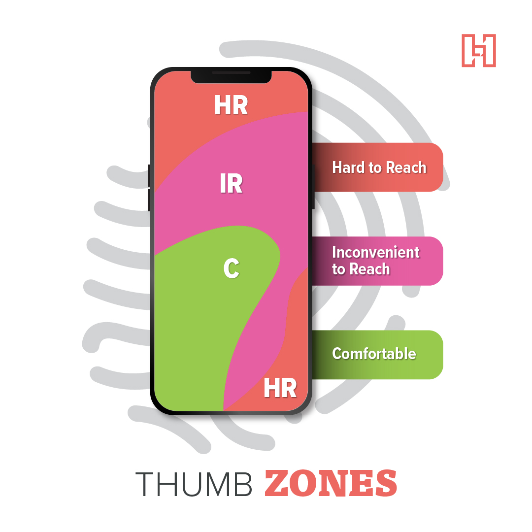
Don’t forget about the thumb zone when designing a mobile website. This is the area on a mobile device where a user’s thumb interacts with the screen most comfortably. When placing your homepage button, website menu, CTA buttons, and other interactive elements, make sure they’re within reach of the thumb zone. Try to keep buttons near the center of the page as well, so users can easily access them whether they’re right or left-handed.
Don’t Forget Mobile Button Sizing
To help with mobile user experience, consider the placement and size of buttons mobile users click on. Remember your visitors are trying to tap a button with their finger, so you don’t want your button to be too small or close to other buttons. When designing mobile buttons, keep sizes between 42px and 72px, depending on the priority of the button. For spacing, allow 8 pixels between the buttons so users can accurately click.
Space Out Clickable Elements
To ensure users won’t have trouble navigating or accessing your site, leave adequate room for clickable elements, which include any links or buttons users may tap on. If they’re too close together, a user may accidentally tap on a neighboring button instead of the one they wanted. Keep your touch target size around 48 pixels or larger for a more convenient user experience.
Improve Site Speed
Mobile page research shows a site that loads in one second has a conversion rate three times higher than a site that loads in five seconds. Site speed can impact your overall search engine visibility as well, as Google gives priority to websites with good user experience. To help improve page speed—especially if it has a lot of content like images or videos—remove any redundant or unnecessary data by minifying your website’s HTML and CSS files and ensure you’re using a performance-focused hosting provider.
Compress Photos & Host Third-Party Videos
To improve site speed with your mobile web presence, optimize your images. You want to have the smallest image sizes possible to compress file size and help with speed while still offering site visitors clean, crisp imagery. Use Kraken to compress images between 200-250 pixels wide so they won’t get distorted or take up too much space. You might also consider using WebP images. When posting videos, embed them from video hosting sites such as Wistia or YouTube, instead of directly hosting them so your mobile site performance doesn’t suffer from lag time.
Prioritize HTML5 Over Flash
The software platform, Flash, was once a popular choice for online content creation that included animations, streaming content, and interactive elements. However, since mobile devices do not support the use of Flash, you should avoid using it when building a mobile-friendly website. Instead, implement HTML5 or JavaScript, which are designed to work seamlessly on mobile.
Remove Any Pop-Ups
Business websites should balance advertisements with user experience. Eliminating pop-ups from appearing on your mobile site can improve user experience. Since site visitors have smaller screens to work with, it can be more difficult to view and close out mobile pop-ups. Plus, pop-ups can’t be triggered at key moments like on a desktop when a user moves to exit the window. Of course, pop-ups are still fine to use with desktop web designs, but it’s best to avoid them when creating mobile-friendly designs.
Follow ADA Compliance
While making a mobile-optimized website, you’ll want to ensure it’s compliant with the Americans with Disabilities Act (ADA). Not only will following these guidelines make your website more accessible to site visitors, but it can also improve your search engine rank since Google prioritizes websites that adhere to ADA. Some simple ways to design an ADA-compliant website include adding ALT text to images, making sure text is easy to read, and using clear calls-to-action.
Test Your Site’s Experience
To ensure you’re offering site visitors the best mobile web experience, check your website on different devices. Look for accessibility issues, pay attention to buttons and links, check site speed, and note any image or video compatibility problems in addition to other user experiences. With thorough website usability testing, you can potentially catch and fix issues your site visitors would otherwise encounter, making for a smoother customer experience.
How to Check a Website for Mobile Friendliness
When conducting a mobile-friendly check on your website, it’s crucial to know what you’re looking for. If you don’t know what needs testing, you won’t know how to analyze your results or how to proceed with changes accordingly. Use the methods below before publishing a mobile-friendly site, and check back regularly after making changes to make sure everything works as intended.
Try a Page Speed Test
A mobile page speed test helps indicate if your website meets Google’s performance and speed standards. This website performance test helps analyze how your website is running on different devices, as well as how users interact with your site. It also diagnoses performance issues and offers actionable suggestions on how a page may be improved.
Use an ADA Compliance Checker
After taking steps to follow ADA guidelines, it’s best practice to use an ADA compliance checker to test for ADA web compliance and accessibility. An ADA and WCAG compliance checker will provide a web accessibility report, which identifies potential local and national website accessibility issues and provides instructions for how to fix them.
Complete Google’s Mobile-Friendly Test

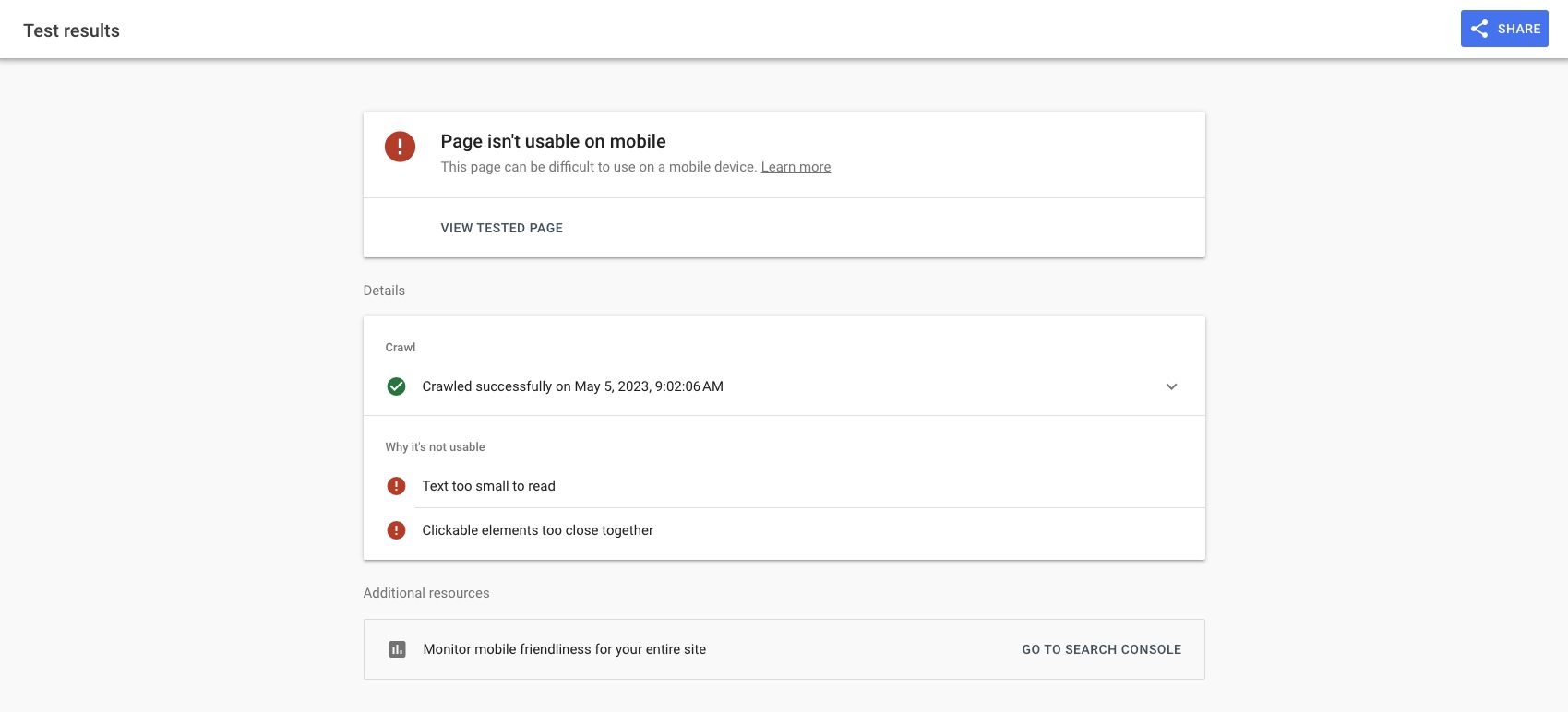
You can test your mobile website using Google’s Mobile-Friendly Test. This resource prepares a quick report of how your website or webpage looks on a mobile device, as well as a list of common usability problems. Google’s mobile-friendly test tool is also used to diagnose issues that range from small font sizes to content running wider than the screen.
Need help with mobile website design? Hurrdat Marketing offers web design services and SEO services that can help you improve user experience and website optimization. Contact us today!


